Making Documents Ugly So The Robots Can Learn
An exploration in degrading digital typography to look like real ink on real paper, for synthetic document generation (and fun).
Why bother?
As a UI/UX designer, most of my career has been about making intuitive, legible and accessible interfaces. This project was quite the opposite: the goal being making digital text look weathered, imperfect, and real (and definitely not WCAG 2.1 compliant).
This exploration was not just for aesthetics reasons either, but rather for synthetic document generation. My hypothesis was simple: I wanted to create realistic looking copies for scanned, photographed and otherwise degraded documents where I knew exactly what the source text was, so I could test, validate and potentially train an OCR/document AI system myself.
If synthetic documents look too clean, they’re useless as real world training data, especially for use cases where the subject documents are user uploaded with diverse document conditions.
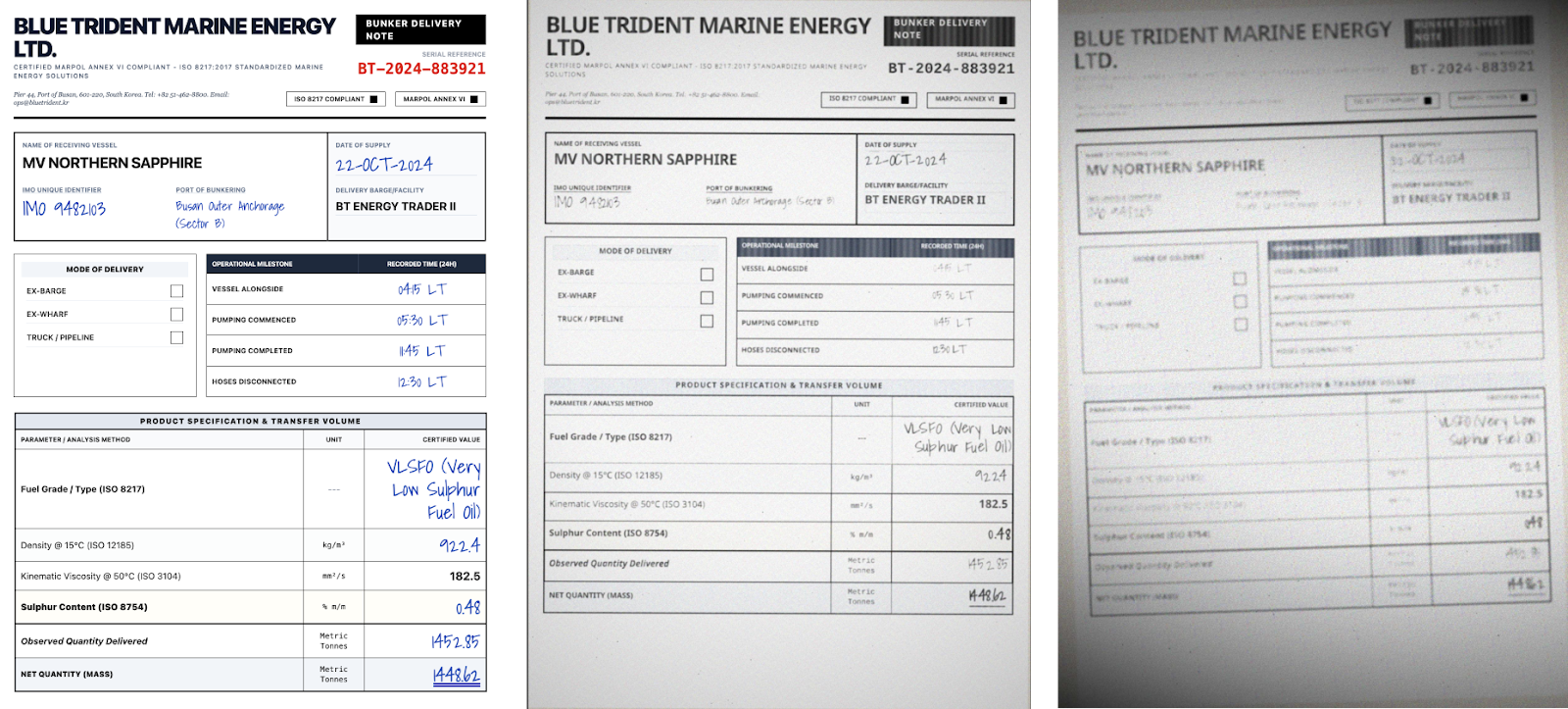
Bunker delivery notes, used by commercial ships for documenting fuel delivery, are a great example of the potential variety of layouts, content and style. With no standardized form, every single fuel delivery company creates its own version of the documents, filled out by hand, and then scanned/photographed at 3am after the field is delivered, and sent back to HQ on land.


So, how do I take pristine digital text and make it look similar to the above so that I don’t have to manually create and/or transcribe documents into source truths? Something I’ve done many times, and often made plenty of mistakes in the transcription process, resulting in inaccurate experiments.
Oh, and as a web person, can I do this whole thing entirely with web technologies?

The Obvious First Try
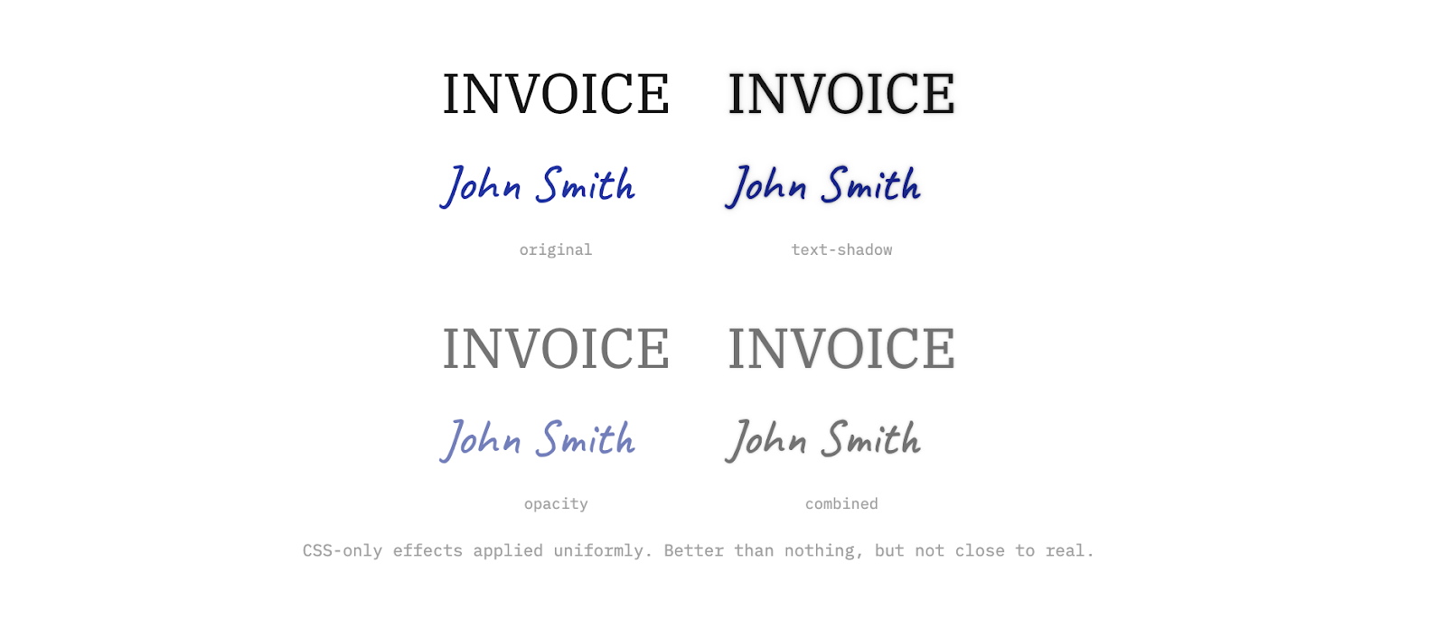
The first thing I obviously reached for was good ol' CSS. Text-shadow, opacity, color adjustments; the usual. Quick to try and easy to tweak via the dev tools.
It didn’t work. Which may have been obvious, but hey, worth a shot.
CSS effects are uniform, so they apply the same treatment to every pixel of a text element. A text-shadow adds an identical halo around every edge. Opacity dims everything equally. There’s no way to make the thin part of a serif fade differently from the thick stroke of the stem. The text is still digitally perfect underneath. Attempts to apply per word or character effects may have helped, but you’d still have the same issue with stroke, intensity and clarity uniformity.
Pixel-Level Control
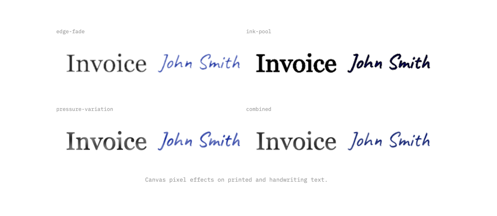
To simulate real ink, especially for handwritten text, I needed to try and replicate the shape of each stroke. I moved to canvas rendering where I could inspect, and then try to modify, every pixel individually.
The trick came down to measuring how far each pixel sits from the edge of a letter. Pixels deep inside a thick stroke behave differently from pixels at the very tip of a serif. Once you have that distance, you can simulate what ink actually does: thin parts fade out, corners get darker where ink collects, and pressure changes across a stroke.
Adding Noise
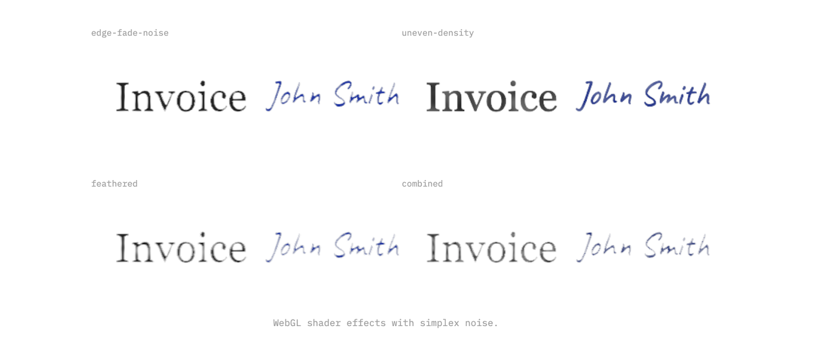
Canvas pixel processing was working, but the results were still too regular. Real ink has organic variation from paper grain, humidity, age, and the physics of liquid on an absorbent surface like paper. Moving to WebGL shaders with simple noise (an efficient, battle tested noise generation algorithm far too complex for my intellect and also apparently a patented one, so OpenSimplexNoise it is) let me then layer multiple frequencies of randomness into the effects. Fine noise for texture, low frequency for gradual density shifts to try and recreate the uneven nature of ink. The result is a type that renders as it were feathering into the paper, and bleeding with some degree of organic irregularity.
We were getting closer.
Still Too Perfect
The effects looked decent in isolation, but applied to a full word, something still felt off. Similar to applying CSS properties, every character ends up with the exact same treatment. Look at the repeated letters below; they’re pixel identical clones, and even with some handwriting fonts having natural variation built into them, it’s not something we could rely on.
Real ink doesn't do that; pen pressure shifts and paper absorbs differently at different points. No two characters are ever truly identical, even written by the same hand moments apart. Uniformity is what makes it look synthetic.
An attempt to resolve this was the addition of a seeded random variation per character. Each letter gets its own multiplier that independently scales every effect. One letter gets heavier ink pooling, another gets more edge fade, a third barely changes.

The Organic Mess
Per-character ink variation helped break the character-level uniformity, but the layout was still a bit too perfect for handwritten text. Every character on a precise baseline, exact spacing, zero rotation. Real handwriting is messier (at least mine is!).
The last character-level step was to try randomized layouts. Each character gets a slight rotation, a nudge off the baseline, a tweak to spacing. Small values, fractions of the font size, but enough to break the rigid geometry, especially in larger blocks of text.
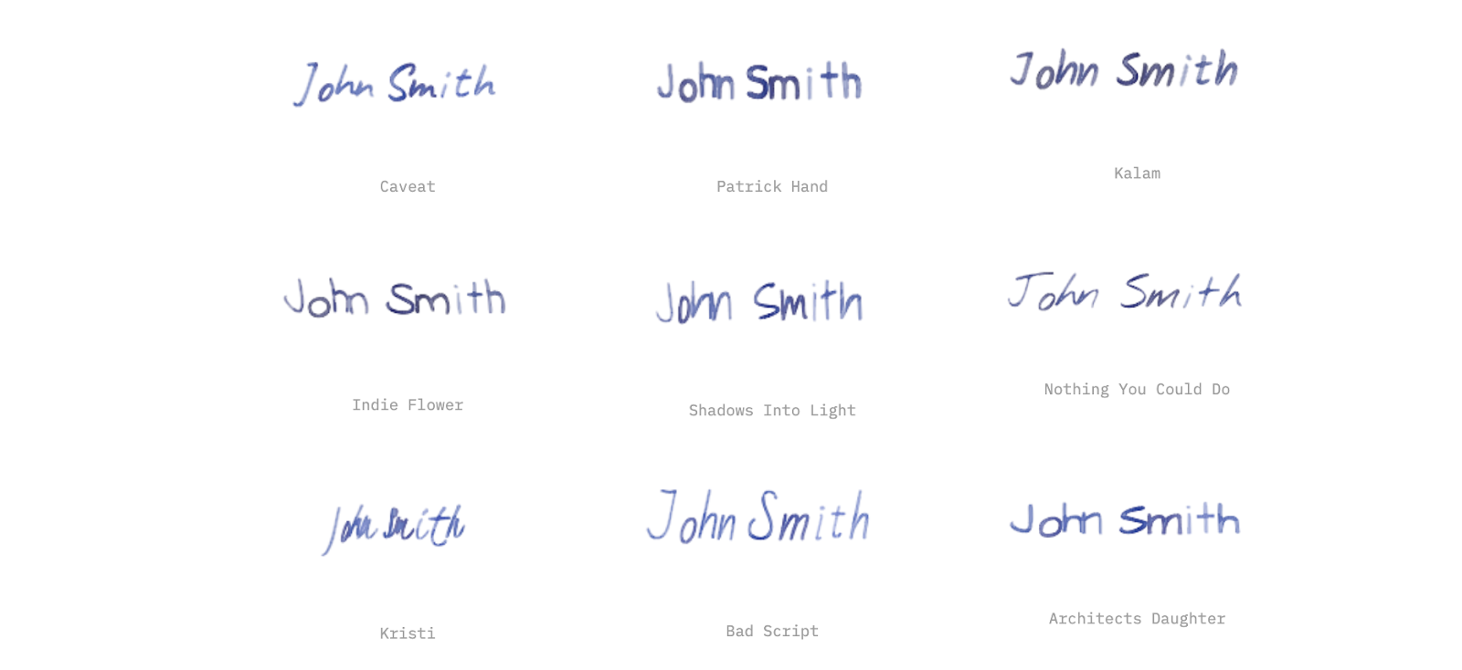
Another thing quickly became apparent; not all handwriting fonts were equal and fortunately Google Fonts made it easy to try a bunch of them. Caveat and Indie Flower were solid options for both long and short form handwritten text. Kristi is perfect for signatures and doctor's notes.
The nice thing about the system we were building was that you could quickly apply these effects to whatever fonts you wanted, and variation of fonts in the documents made things even more realistic.
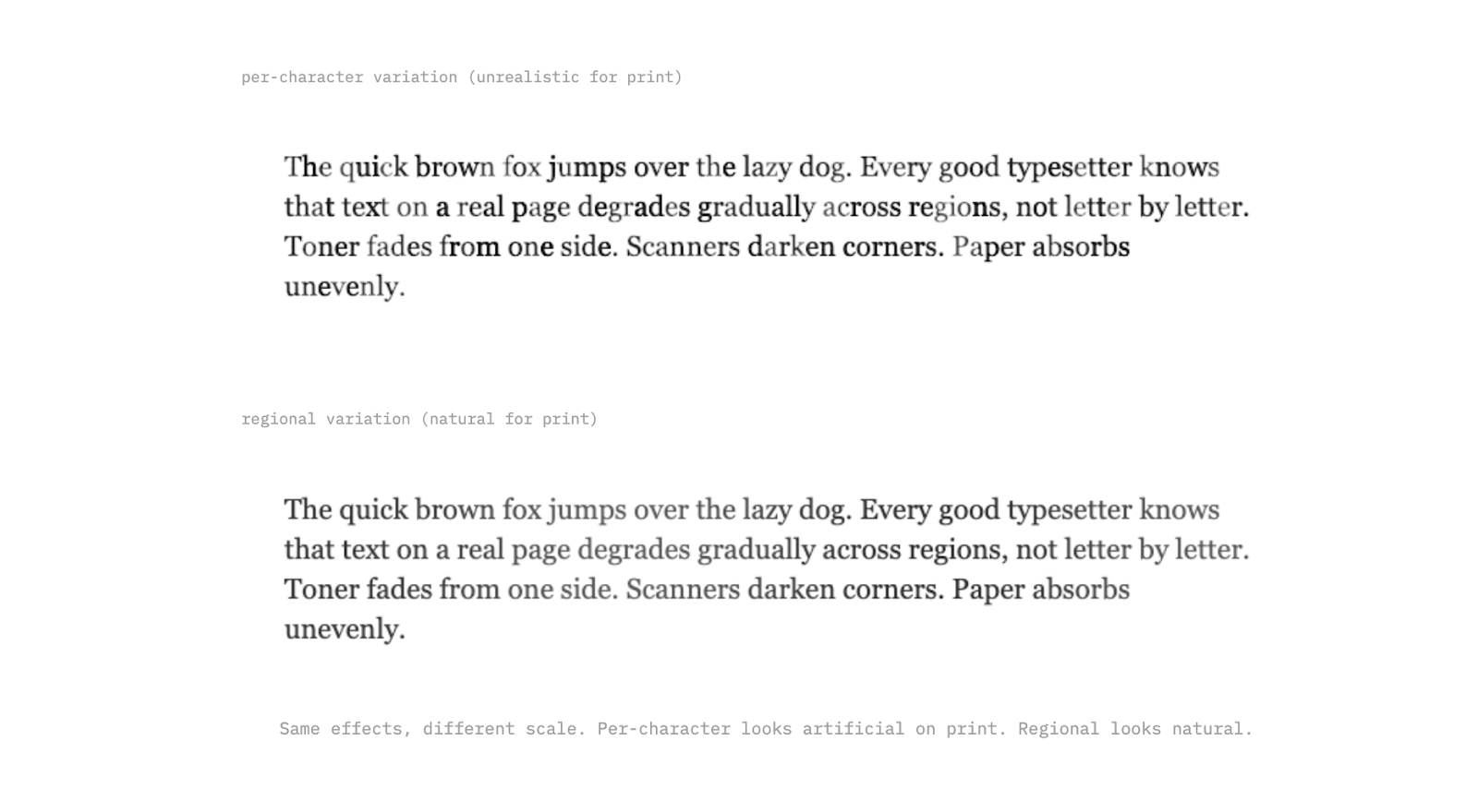
The Right Scale
Per-character variation works for handwriting, where every letter really is different. But for printed text, it looks wrong; a laser printer doesn't randomly fade individual characters. The variation happens at a larger scale: toner runs low gradually across a region, a scanner lid presses unevenly, paper absorbs moisture from one edge.
For typed text, the effects need to operate at the paragraph or page level. Gradual pressure shifts across a line, regional fading from one corner, subtle density changes that span whole words. We can use the same toolkit, just applied at a different scale.
Printed text also has its own specific artifacts that handwriting doesn't. Toner speckle from a low cartridge, micro-banding from a worn printer, and light shifts between passes. These are predictable, mechanical patterns, which in some ways makes them easier to simulate than the organic chaos of handwriting, but they require their own tweaking as well.
From Effects to Documents
Text degradation on its own is interesting, but the real goal was generating full synthetic documents at scale. That means invoices, contracts, forms, receipts; complete pages with layouts, tables, logos, and mixed content. To the previous point about diversity, we also can’t rely on the same layouts, styles and designs; it needs to be messy and varied to be meaningful.
The approach I landed on was using coding agents to generate HTML/CSS templates for each document instance; no repeated templates by document type but rather clear instructions about schema, common fields, common nuances and variety; a model like Gemini Flash 3 can then take it from there and create realistic document layouts for just about any type you can imagine.
The main key is starting with a structured JSON for all of the fields you want, and forcing the coding agent to just use templated variables instead of hard coded values in those HTML files; this means you can then render in the real values at render time, and ensure that the documents will be 1:1 with the source truth. Allowing the agent to fill in whatever values it wants ultimately completely defeats the purpose of this synthetic document generation approach.
Once you have the clean HTML, the rendering pipeline takes over. First, text-level effects get applied: the ink degradation, per-character variation, noise, and all the work described above. Then, document-level effects layer on top. These simulate what happens to the page itself after it's been printed: slight page rotation from a misaligned scanner feed, uneven lighting gradients from a phone camera held at an angle, black bars from a scanner lid that didn't fully close, compression artifacts from being saved as a JPEG one too many times, paper texture and aging.
The separation matters. Text effects simulate how ink lands on paper. Document effects simulate what happens when someone tries to digitize that paper again. Stacking both is what gets you from "obviously synthetic" to "looks like it came out of someone's filing cabinet."
The other advantage of HTML-based generation is variety. Swap a few CSS rules and the same invoice template looks like it came from a different company. Change the font, adjust the margins, move the logo. While not as effective as generating a unique net new HTML file every single time, this approach lets you turn 200 unique document layouts into 1000 variants, and combined with 4-5 levels of degradation, you’re now at 5000+ document examples with clean, verifiable source truth. That's how you get training data that actually generalizes.
Now what?
At the end of this experiment, I was pretty happy with where I landed; handwriting looked realistic, long form printed text looked weathered, and the pipeline could produce full documents that looked like they'd lived a life before being scanned.
But there's more to tackle. Real scanned documents come with page-level artifacts that go beyond what I've covered here: skewed perspectives from phone captures, staple shadows, fold creases, coffee stains, redaction marks, sticky notes partially covering text. Each of these is its own simulation problem.
From there, the path forward is pairing this synthetic data with ground truth labels and feeding it into OCR and document understanding models. A system like this ultimately puts you in control of the generate so you control the labels, which means you can produce training data at whatever volume and variety you need without manually annotating a single page.